Redd's
Client: Redd's Colombia
Year: 2024
Packaging redesign
Packaging Designer: Maria Bilius
As part of pitch proposal.
Challenge
As part of a packaging pitch contest, the challenge was to rethink Redd’s Colombia’s identity. In the Colombian market, citric-flavored beers like Redd’s are often perceived as feminine, creating a barrier for broader adoption. The task: make the beer feel fresh, youthful, and gender-neutral, while staying true to the iconic green color palette.
Insight / Strategy
The design approach centered on respecting Redd’s brand equity while softening the gender divide in perception. By incorporating playful citrus-inspired illustrations and a youth-oriented design language, the packaging aimed to invite a broader demographic—appealing equally to men and women.
Creative process
-
Built moodboards around citrus freshness, Colombian vibrancy, and youth culture.
-
Explored how small, minimal illustrations could introduce flavor cues without feeling overly decorative.
-
Balanced modern simplicity with bold shelf presence, refining layout and color use for impact.
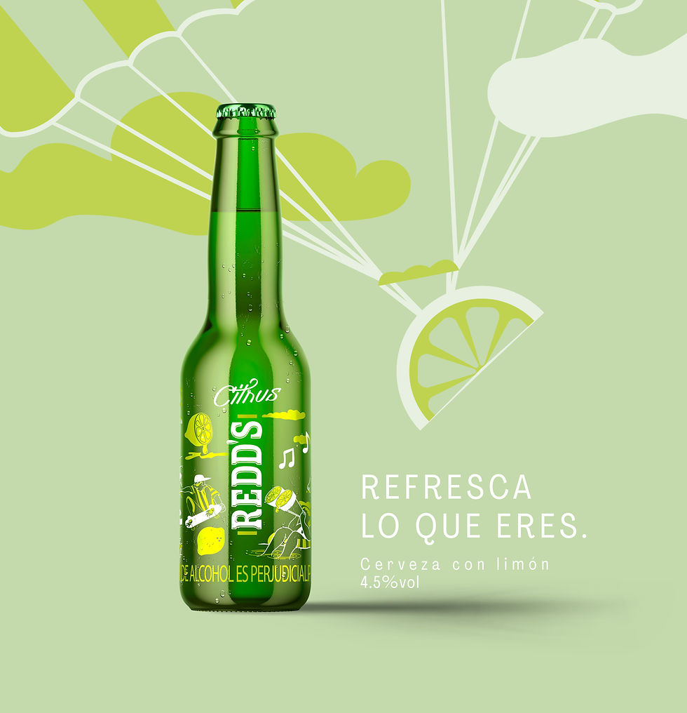
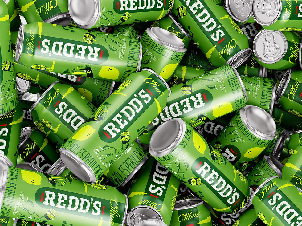
Solution
A refreshed can and bottle system, maintaining green as the dominant color for brand recognition.
Introduced bright citrus accents and small illustrations to bring energy and character.
A visual language that feels modern, dynamic, and inclusive—bridging the gap between heritage and innovation.


